VISIT CHELTENHAM
Brand Strategy and Branding design
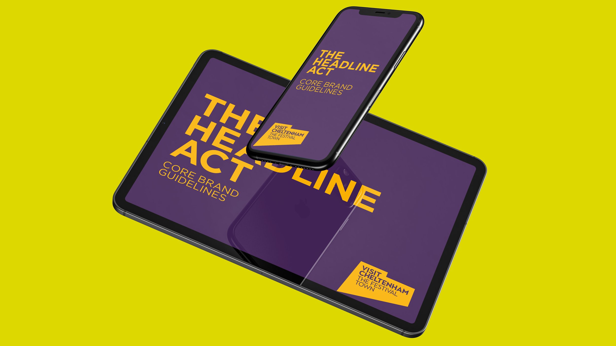
The project began by carrying out a brand strategy consultation with key stakeholders in Cheltenham’s culture, leisure and visitor economy, including representatives from Cheltenham Festivals, Cheltenham Racecourse, Cheltenham BID and Cheltenham Council. What we discovered was that the spirit of Cheltenham has remained the same for 250 years. People originally visited Cheltenham to drink from its healing spring, and to refresh their mind body and soul. Today, people still visit Cheltenham to refresh their mind, body and soul. Only now, the healing waters have been replaced by the town’s refreshing festival vibes. To highlight these festival vibes, we created a logo that reflects the uplifting lighting you experience at festivals and the strong straight lines of our Regency architecture. The logo also acts as a beacon (think Batman’s Bat-Signal) summoning visitors to the town. The core colours of Purple and Gold, are an eye-catching nod to Cheltenham’s regal past and also a celebration of the festival atmosphere which now characterises the town.


GIVE US
A TINKLE
-
me@mrgreenwood.co.uk
07515 743 225


